Page 1 of 1
Excel help - Charts
Posted: Fri Sep 04, 2020 3:49 pm
by McNab
I'm hoping the RevCounter's excel gurus have made it over here.
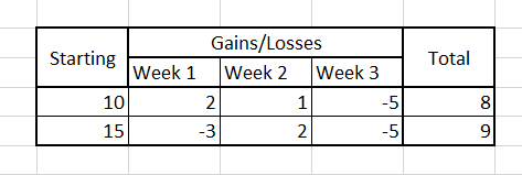
If I have a spreadsheet like this:
- sheet.PNG (4.86 KiB) Viewed 1584 times
Is there an easy way to have line style chart that displays the week by week running total? So the first line would go from 10 to 12 to 13 and down to 8 and so on.
Thanks.
Re: Excel help - Charts
Posted: Fri Sep 04, 2020 4:11 pm
by JackyJoll
Make a row with that sum in it. Select that row and the Week row and insert chart.
Then format it as every choice of chart type until you accidentally find one that looks right.
Re: Excel help - Charts
Posted: Fri Sep 04, 2020 10:50 pm
by Mr. Dazzle
Create another row at the bottom with the running total. You can get excel to calculate that bit by just adding the two relevant cells together.
You the want an X-Y scatter plot* with the week numbers as the X field and the newly calculated running total as the Y.
I would probably create a second new row with your week numbers (0, 1, 2 etc rather than "Week 1") because Excel will cope with that in a much more intuitive way. If you can get it to sensibly work with dates and they produce a graph with 'em you're a smarter man than I
 *IME you pretty much always want an X-Y scatter plot, all the others are crap. Except maybe pie.
Re: Excel help - Charts
Posted: Mon Sep 07, 2020 9:47 am
by McNab
Mr. Dazzle wrote: Fri Sep 04, 2020 10:50 pm
Create another row at the bottom with the running total. You can get excel to calculate that bit by just adding the two relevant cells together.
You the want an X-Y scatter plot* with the week numbers as the X field and the newly calculated running total as the Y.
I would probably create a second new row with your week numbers (0, 1, 2 etc rather than "Week 1") because Excel will cope with that in a much more intuitive way. If you can get it to sensibly work with dates and they produce a graph with 'em you're a smarter man than I
*IME you pretty much always want an X-Y scatter plot, all the others are crap. Except maybe pie.
I want each row to have it's own line on the chart and there's going to be 20 of them.
But from what you both say I can create a bunch of row that give the sums and make a chart from those.